
Colour Theory for Professional Graphic Designers: The Language of Colour at Delight
By Delight Technical College | School of Media & AI- Graphic Design | 2026
Colour is the most emotionally immediate element of design. Before a viewer reads a word or consciously notices any design decision, they have already felt something in response to the colours before them. Professional colour theory goes far deeper than broad associations like ‘red means urgency’ and at Delight Technical College, it is taught as the sophisticated, powerful professional tool it truly is.
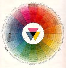
🎨 The Colour Wheel and Harmony Systems
Colour Harmony:
- Complementary- opposite on the wheel. High contrast, high energy, visually striking
- Analogous- adjacent on the wheel. Harmonious, cohesive, easy on the eye
- Triadic- three equally spaced colours. Vibrant and dynamic with careful management
- Monochromatic- variations of a single hue. Sophisticated and cohesive
Core Properties:
- Hue- the pure colour (red, blue, green)
- Saturation- intensity or purity (vivid vs muted)
- Value/Brightness- how light or dark a colour is
- Temperature- warm (reds, oranges) vs cool (blues, greens)
🧠 Colour Psychology in Design
- Red: urgency, passion, appetite, calls to action, food brands, promotions
- Blue: trust, calm, professionalism, finance, technology, healthcare
- Green: nature, health, growth, environment, wellness, agriculture
- Yellow: optimism, warmth, attention, children’s brands, creative fields
- Black: luxury, sophistication, authority, premium fashion, formal communication
- White: purity, simplicity, space, healthcare, minimalist design, premium products
🌍 Colour in the Kenyan and African Context
- Green, gold, and red- pan-African associations and continental identity
- The Kenyan flag colours- black, red, green, and white carry specific national significance
- Traditional ethnic colour systems- Maasai red, Kikuyu ceremonial colours
- Religious colour associations- varying across Christian, Muslim, and traditional communities
- Market colour psychology- how Kenyan consumers respond to retail colour schemes
🔬 Technical Colour for Professional Practice
RGB vs CMYK:
- RGB- the additive colour system for screens and digital media
- CMYK- the subtractive system for professional print production
- Hex codes- precise colour specification for digital design
- Pantone- standardised colour matching for professional print
Colour Accessibility:
- Contrast ratios- ensuring text is readable for all users
- Designing for the 8% of men and 0.5% of women with some form of colour vision deficiency
- WCAG standards- international accessibility guidelines for digital design
🎓 Colour in Delight’s Graphic Design Programme
- Building brand colour palettes- primary, secondary, and accent colours
- Applying colour systematically across all brand touchpoints
- Adapting colour for different media- print, digital, and environmental
- Using colour in typography for hierarchy and communication
“Colour is not decoration, it is communication. The right choice communicates the client’s message before a single word is read. At Delight, we train designers who choose colour with intention and confidence.”
📍 Delight Technical College | Muindi Mbingu Street, Opposite Jevanjee Gardens, Nairobi | +254 722 533 771 | www.delight.ac.ke